November 2023
This is a breakdown of this site's navbar that I created with three of my opinions in mind: One, I don't personally enjoy hamburger menus. I find them to just be an extra click to get to the content I want and they hide the navigation options available. Two, I think navbars typically take up an unnecessary amount of space on every page that could be used for content instead. Three, I think the user should, if possible, have an option to change the navbar to fit their personal preference, in terms of location and size.
I'll talk about giving the user personalized options for the navbar first. In case you haven't noticed, there's a draggable anchor button below the navbar that allows the user to change the location to wherever they see fit, and importantly, it will persist that location across pages thanks to NextJS routing.
This is done by using a ref to the navbar and calculating it's offset relative to the mouse position. On mobile, we have to look at touch position instead of mouse events.
let boundingRect = navRef.current?.getBoundingClientRect();
if (boundingRect) {
    const navWidth = boundingRect.width;
    offsetRef.current = {
        x: e.touches ? e.touches[0].clientX-boundingRect.left-navWidth/2
            : e.clientX-boundingRect.left-navWidth/2,
        y: e.touches ? e.touches[0].clientY-boundingRect.bottom
            : e.clientY-boundingRect.bottom
    };
}
Then we just update the navbar's position based on the offset and the current user position.
let offset = offsetRef.current;
navRef.current.style.left = (e.touches ? e.touches[0].clientX-offset.x : e.clientX-offset.x)+'px';
navRef.current.style.bottom = window.innerHeight-(e.touches ? e.touches[0].clientY-offset.y : e.clientY-offset.y)+'px';
This gives the user a smooth and intuitive way to move the navbar to wherever they want.
The other customization option is the ability to minimize the navbar. This is especially helpful for mobile users who are reading an article (just like this one) and want to maximize their screen real estate and lessen the distraction of the navbar.
As you might expect, the actual minimizing is done with a simple state change, but the animation to hide and show the navbar is a bit more complicated. For the minimize button, we can change the cursor hover icon based on the state of the navbar using data attributes.
.minimize_button[data-minimized="true"]:hover, .minimize_button[data-minimized="true"]:active {
    cursor: n-resize;
    background-color: #ededed;
}

.minimize_button[data-minimized="false"]:hover, .minimize_button[data-minimized="false"]:active {
    cursor: s-resize;
    background-color: #ededed;
}
Then we can use the same data attribute to change the animation of the navbar, which I'll leave up to you to figure out.
The combination of these two customization options gives the user a lot of personalized control over the navbar and I think is a nice touch for making a user feel more comfortable on a site.
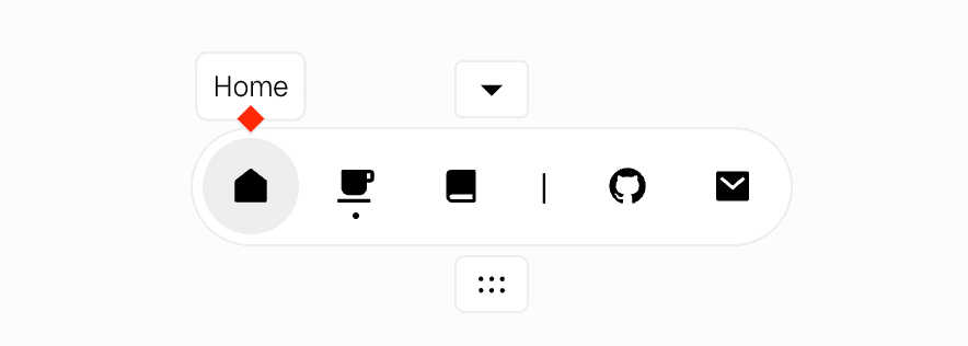
On hover of each navbar item, a tooltip will appear with the name of the page. This is always espeially useful when the icons being used are non-standard and might not immediately reflect their links.
The tooltips are all absolutely positioned and hidden by default 'inside' of each icon container div. Then on hover, we can use the data attribute to show the tooltip. The non-trivial part of this is adding the bottom triangle to the tooltip to point at the related icon.
This is done using a ::before pseudo element on the tooltip div. I created a square, rotated it 45 degrees, moved it down, then used a box-shadow on two of the sides to blend it into the rest of the tooltip. It might look more obvious if I show you re-color the square in question.

The last thing I want to talk about is the active path highlighting. It's important to give a user feedback on any action they take, and clicking on a navbar item is no exception.
I use a small dot that animates purposefully down from the icon of the active path. You may think an OnClick would be best here, but there's actually not a single OnClick in the entire navbar. Instead, I use active paths from NextJS' Link component to determine which path is active. Then I use a data attribute to animate the dot on the active path.
<Link href="/" className={styles.icon_container} data-active={pathName == '/' ? 'true' : 'false'}>.icon_container[data-active="true"]::before {
content: "";
position: absolute;
height: 3px;
width: 3px;
border-radius: 50%;
background-color: black;
bottom: -4px;
left: 50%;
transform: translate(-50%, -300%);
animation: slide-from-top var(--transition-duration) ease;
}
Last but certainly not least, I want to talk about accessibility. I think it's important to make sure that a site is usable for everyone, which means that having good and consistent focus states is not an after thought, but a requirement.
I use a consistent, bright red border around all interactable elements to show focus, which is easy to do with a :focus-visible pseudo element. This is especially important for users who navigate with a keyboard, as it allows tabbing through the site to be intuitive and easy.
You may also notice that the icons here have different border radii. I did this to give the impression that the icons are conforming to their container rather than the other way around. Using css selectors (:first-child and :last-child) I can give the first and last icons individual border radii on hover.